Jetpack Compose: Buttonコンポーザブルを使う
今回のJetpack ComposeサンプルはButtonコンポーザブル( androidx.compose.material.Button)です。androidx.compose.materialパッケージに含まれているButtonコンポーザブルはTextButtonやOutlinedButtonなど種類も豊富で、マテリアルデザインガイドラインに準拠しています。
Buttonコンポーザブルが理解できればその他の理解も容易になるので、この記事では基本的かつ応用範囲が広いButtonコンポーザブルを解説します。
ボタンを表示する

Buttonコンポーザブルの引数はクリック時の動作を指定するonClickと表示内容を指定するcontentがあれば、ひとまず大丈夫です。
@Preview(showBackground = true)
@Composable
fun ButtonPreview() {
    Button(
        onClick = { /* Do something */ },
    ) {
        Text("Button")
    }
}
onClick時の動作とButtonと表示する contentにTextコンポーザブルを与えています。引数contentは最後のパラメータとして別の関数 RowScope.() -> Unit として定義しているため、引数リストの外側にだしてButton(…){…ここがcontentに与える関数…}と表現できます。Kotlinのこの挙動はcallSuffixと呼んだりします 。
ボタンの表示内容を変える
ButtonコンポーザブルのcontentはRowScopeのため、表示内容は横に並びます。次の表示はTextコンポーザブルを2つ表示した場合です。

    Button(
        onClick = { /* Do something */ },
    ) {
        Text("Button")
        Text("Button")
    }
ボタンのスタイルを変える

Buttonコンポーザブルの色を変更したいときはcolors引数を使います。このcolorsはButtonColorsで、直感的に色と聞いて思い浮かべるandroidx.compose.material.Colorsとは別の型なので間違わないように気をつけてください。
@Preview(showBackground = true)
@Composable
fun ColorStyledButton() {
    Button(
        onClick = { /* Do something */ },
        colors = ButtonDefaults.textButtonColors(
            backgroundColor = Color.DarkGray,
            contentColor = Color.White,
            disabledContentColor = Color.LightGray
        )
    ) {
        Text("Button")
    }
}
サンプルコードでは背景を濃い灰色、コンテンツを白(サンプルの場合はButtonという文字列)、ボタン無効時のコンテンツを明るい灰色を指定しています。
ButtonDefaultsが提供するボタンのためのパラメータ
ButtonDefaultsはButtonコンポーザブルのデフォルト実装を持っており、textButtonColors関数以外にも便利な定数があります。
- ContentPadding:コンテンツに指定するパディングのデフォルト値(左右16dp、上下8dp)。Button内部のコンテナとコンテンツの間に指定される
- IconSize:アイコンサイズ(18dp)
- IconSpacing:アイコンとテキストの間隔(8dp)
- MinWitdth:ボタンの最小横幅(64dp)
- MinHeight:ボタンの最小高さ(36dp)
elevation関数はマテリアルデザインに準拠したアニメーションを提供するButtonElevationを生成し、Buttonコンポーザブル向けのスタイル設定関数buttonColorsやOutlinedButtonコンポーザブル向けのスタイル設定関数outlinedButtonColorsがあります。
アイコンつきボタンを表示する
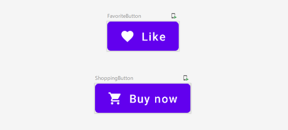
アイコンつきボタンを表示する場合、IconコンポーザブルとTextコンポーザブルを並べるだけで実装できます。アイコンのサイズやアイコンとテキストの間隔はButtonDefaultsのIconSizeやIconSpacingを利用します。
@Preview(showBackground = true)
@Composable
fun FavoriteButton() {
    Button(onClick = { /* Do something */ }) {
        Icon(
            Icons.Filled.Favorite,
            contentDescription = null,
            modifier = Modifier.size(ButtonDefaults.IconSize)
        )
        Spacer(Modifier.size(ButtonDefaults.IconSpacing))
        Text("Like")
    }
}
@Preview(showBackground = true)
@Composable
fun ShoppingButton() {
    Button(onClick = { /* Do something */ }) {
        Icon(
            Icons.Filled.ShoppingCart,
            contentDescription = null,
            modifier = Modifier.size(ButtonDefaults.IconSize)
        )
        Spacer(Modifier.size(ButtonDefaults.IconSpacing))
        Text("Buy now")
    }
}
サンプルコードで利用しているアイコンは、お気に入りを示すハートマークと買い物を示すショッピングカートを使っています。 androidx.compose.material.icons.Iconsパッケージのものを指定しました(他にも沢山のアイコンが標準で用意されています)。
マテリアルデザインガイドラインに合わせた実装
マテリアルデザインガイドラインにはボタンの振る舞いについて親コンテナ(レイアウトに応じてサイズが変わるなどレスポンシブな変化に強い)を考慮したガイドラインを出しています。サイズや幅をカスタマイズする際は、中央揃えで表示するなどベストプラクティスを守るようにしましょう。
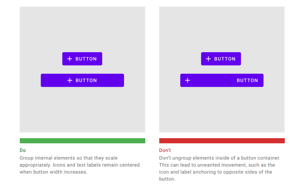
ガイドラインではカード表示した際のボタン表示や、ユーザーインタラクションの導線などUXに配慮したボタンの使い方を学べます。
Buttonコンポーザブルの引数
@Composable
fun Button(
    onClick: () -> Unit,
    modifier: Modifier = Modifier,
    enabled: Boolean = true,
    interactionSource: MutableInteractionSource = remember { MutableInteractionSource() },
    elevation: ButtonElevation? = ButtonDefaults.elevation(),
    shape: Shape = MaterialTheme.shapes.small,
    border: BorderStroke? = null,
    colors: ButtonColors = ButtonDefaults.buttonColors(),
    contentPadding: PaddingValues = ButtonDefaults.ContentPadding,
    content: @Composable RowScope.() -> Unit
) {
- onClick:ボタンクリック時に呼び出される
- modifier:レイアウトへ反映するmodifier
- enabled:ボタンの状態変更(有効/無効)。無効時にはonClickは呼ばれない
- interactionSource:インタラクションに合わせてスタイルや振る舞いを変えたいときはソースとなるストリームを設定する
- elevation:ButtonElevation。エレベーションを無効にしたいときはnullを指定。ボタンのエレベーション(高さ)が変わるので影のサイズ等に影響
- shape:ボタンの形(と影)を指定
- border:ボタンの周囲に描画する境界線を指定
- colors:ButtonColors 。ボタンの状態に応じたスタイル変更
- contentPadding:ボタン内部のコンテナとコンテンツのパディング
- content:ボタン表示するコンテンツを提供するコンポーザブル関数
今回は、Buttonコンポーザブルを紹介しました。実はButtonと名前がつくマテリアルコンポーザブルはたくさん存在しています。FloatingActionButton、FABから更に表現力を拡張したExtendedFloatingActionButton、アイコンを表示するIconButton、IconToggleButton、続きを読むなどマテリアルカードによく使われるOutlinedButton、TextButton、選択式のRadioButtonです。
いずれもButtonと名前がつけられていますが実装に関連性がなかったりします。たとえばIconButtonとIconToggleButtonはandroidx.compose.material.IconButonにそれぞれ実装がありますが、Buttonコンポーザブルとは関係していません。FloatingActionButton(FAB)とExtendedFloatingActionButtonは一部FABの実装を共有しています。
そしてTextButtonとOutlinedButtonはButtonコンポーザブルの引数の設定値を少し変えたものでシンタックスシュガーに近いものです(便利です)。
Buttonコンポーザブルを知っていれば応用がきくため、さわってみて慣れてきたら次のリファレンスを読んで理解を深めてみてください。
- Buttonコンポーザブルのリファレンス
- マテリアルデザインガイドライン(マテリアルボタン)
- ボタンの色を決めるButtonColorsインターフェイスのリファレンス
- Buttonコンポーザブルのデフォルト実装を持っているButtonDefalutsのリファレンス
- androidx.compose.material.icons.Iconsに含まれているアイコンのリファレンス
今回の記事はこれでおしまいです。お疲れさまでした。
About The Author
ひつじ(mhidaka)
Software Engineerだよ。DroidKaigi Organizer / Androidと組込とRe:VIEW。techbooster主宰。mhidaka's writings http://booklog.jp/users/mhidaka 技術書典! http://techbookfest.org